Duality of Design
As designers, we look at the art and the science of any given object, space and scenario, and we attempt to balance both aesthetic and technicality in the most seamless way we can. It becomes part of who we are: part artist, part scientist. However, art and science have two different ways to come into being: art being a creation of new, and science being an innovation of an existing, and this can put the designer into conflict if unchecked.
The artist within the designer is most prevalent when we have the opportunity to work conceptually, where we try to inspire our clients, to convey our thinking across the room so everyone can see. We are crafting a space, making a place for light to be incorporated, creating a new vision with confidence. Art is important to us, because light is a sensory experience, and can emote people in different ways depending on how it is executed. Lighting can depict how a person experiences a space: a low-light environment can create an intimate atmosphere, and a bright and indulgent application of light can raise the spirits of its users.
The scientist within the designer then starts to weigh in, calculating and measuring our way to achieving what our vision and goal is. Technical characteristics are tested, trialled, observed and scored on their performance. We invite the innovation into the projects along with the newest products, and techniques being employed are discussed and demonstrated. The discipline of lighting technicality is multifaceted, with considerations of both the quality of light and the quality of the installation requiring consideration via analysis and study, before carefully choosing what we recommend.
Combining these two elements is where the elegance of being a designer comes into play, as we weave our way through the design process, ensuring that what we’ve portrayed conceptually is technically possible and that the artistic vision is always adhered to, and that we don’t lose sight of it along the way. We also consider what happens beyond the completion of the construction – the projects will stand for years, and our vision isn’t only for “Day One” but for the ongoing life of the space. Projects are our prize, and we want to enjoy looking back on them with pride.
Some examples of creation and innovation working together in perfect execution are found in the following lighting design projects, where the initial conceptual idea lives through into being a finished space.
Hard Rock Hotel

An exciting project that Nulty completed last year was the ground floor of Hard Rock Hotel London, where the incredible design was pulled through from conceptualisation to completion by a strong design and contracting team. The central bar feature installation holds a colour-changing ceiling design that combines the aesthetic considerations of the fins, the visible LED nodes with the technical thoughts of specifying an appropriate product, and programming of the control system to make it all work. Utilising the available technologies and using them in a new way allowed us to employ both our creative and innovative sides. (See the project in full here.)
Rowbots

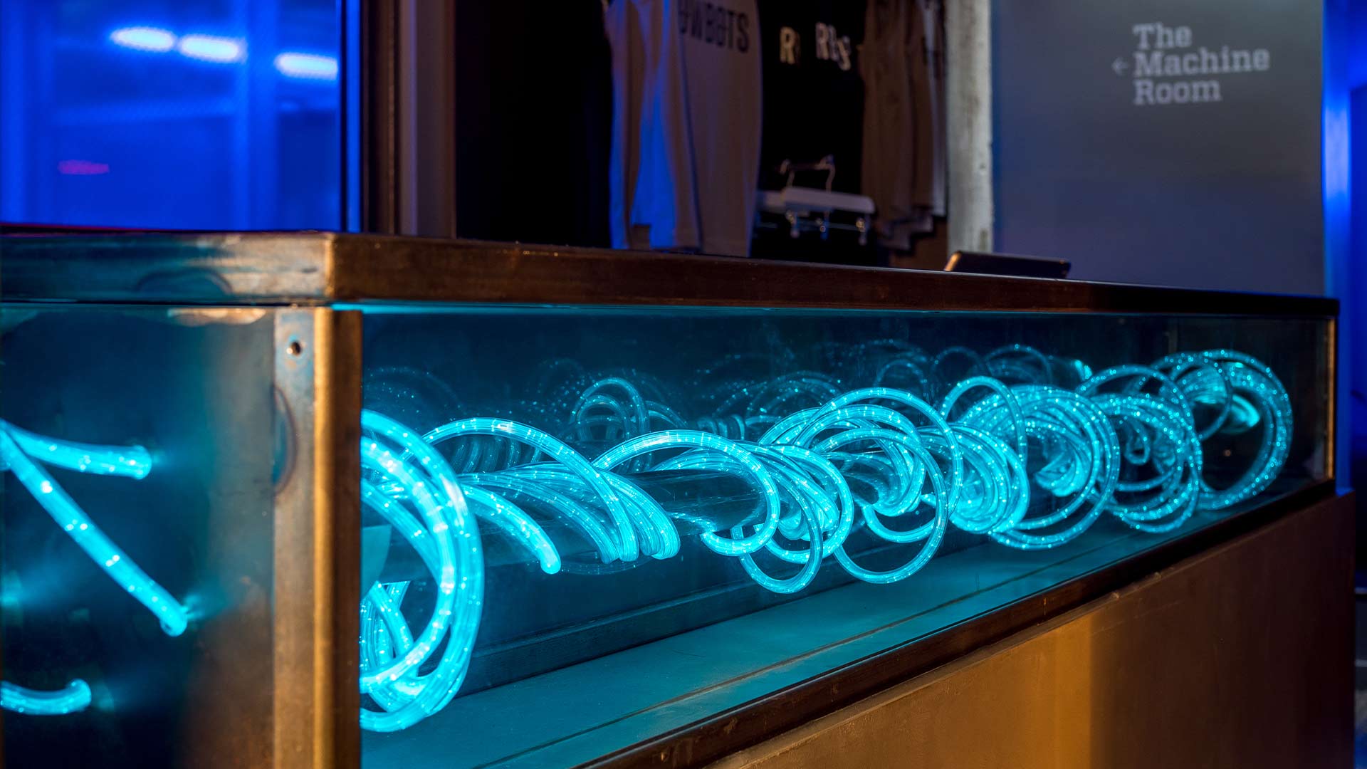
The concept we started working on with the team at Rowbots (a boutique rowing gym) had a strong theme with confident and bold lighting elements. The visualisations showed ambition and creativity from the interior architect (Sarah Mannerings Studio), so taking this on board we technically brought together a solution to realise the aspiration. The challenges within Rowbots mostly occurred with the excavation of the refurbished site giving the team surprises. Each new development allowed us to be creative and innovative with the solutions; the art was always foremost in our minds when technically overcoming a problem. (See the project in full here.)
Creative Studio

The art and design of a project doesn’t have to be inclusive of colour and texture in a bold way, and what we do as designers is complement and bring out the best of any scheme. The brief for this creative studio was to be unobtrusive and minimal in our approach – finding the perfect way to do that involved a mix of creativity and innovation. Technically, we respected the fact that it was a working office, and made sure that we understood the requirements of the team, bringing light to the correct surfaces and aesthetically balancing the space with smaller moments and wider expanses of light as necessary. (See the project in full here.)
Images: Rowbots [includes banner image] © Jim Catlin / Hard Rock Hotel © James French / Creative Studio © Tom Green
Blog post by Rebecca Hodge


