Retail lighting design
The collapse of well-known retailers is fresh in our minds and this has sparked debate across the industry about the business model retailers are using and how department stores, concessions and high-street shops can stay relevant. Analysis of successful department stores and retail brands such as Selfridges, John Lewis & Partners and Bloomingdale’s shows a common set of principles (some of which are explored below), which may contribute to them remaining strong in the current climate.
Today’s retail market requires a strong online offering but this alone won’t keep stores open. To pull customers into the bricks-and-mortar stores requires continuous, staged (rather than reactive) investment back into the fit-out of spaces, making the shopping experience exactly that: an experience.
Experiential retailing puts the relationship between the brand and its consumers first and the actual act of selling second. And for designers it’s about understanding the emotional connection between the brand and its consumers, and then reinforcing it. Such experiential store design seems to fall roughly into two camps:
1. Hospitality experience: where the store engenders the feeling of a bar, restaurant or hotel, and a consumer feels relaxed and connected to a lifestyle.
2. Cultural experience: where the store elevates its products to those of museum artefacts, so they’re viewed like pieces of art.
The former example has started to place emphasis on FF&E and in particular decorative lighting, which creates a residential feel or hospitality style. Decorative lighting fixtures make a space more “human” – they create intimacy, giving a human scale to a space.
A clever trick that lean and competitive retailers are aware of is adapting their stores to the way that their customers want to use them. For customers to connect with a brand, retailers require a clear brand message that’s effectively but subtly applied through interior design and lifestyle image.
As a lighting design practice we’re privileged to have worked on a number of retail fit-outs from luxury boutiques to high-street giants, all with varied styles and brand messages, from sophisticated and classic to minimalist and even kitsch. The practical and operational needs of these stores vary immensely but something they all have in common is that their brand has a strong narrative, which makes our job as designers significantly easier.
We spoke to Sonia Tomic from Universal Design Studio, with whom we recently completed a phase of the Selfridges Birmingham fourth floor renovation. Sonia comments: “Stores seem to be more ‘lifestyle’ and experience-focused now. Retail clients see the benefit in their interiors feeling more gracious and home-like in some instances. Spaces where customers come to interact and inhabit the brand, rather then just shop for a product.”
So where does a lighting consultant fit into this equation? If the client has engaged an interior architect and lighting consultant it means they’re aware of the value that lighting can add. Decorative lighting is becoming more widespread in retail spaces and when it works alongside architectural lighting installations it can be a cost-effective way to fit-out large premises with an impactful brand standard. If we’re involved at the right stage of the project the decorative luminaires can be made to “work” a little harder, which can reduce the quantity of focused spotlights and create layers of light for a richer environment.
Examples of this principle being applied can be seen in the following projects:
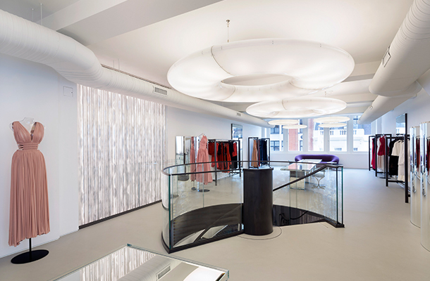
1) Alaïa, London – this distinctive yet simple decorative pendant luminaire not only provides a canvas for the brand’s luxury goods, it also provides a consistent colour of light and quality of lit environment across all Alaïa fashion houses. The luminaire contributes to a large portion of the functional lighting and the most recent version (specified in this new flagship store on Bond Street) uses LED light sources with excellent colour rendering.

Image © Agnese Sanvito
2) Selfridges Body Studio, London – this Neri&Hu Japanese-influenced fit-out provides a soothing environment using natural materials. Large decorative back-illuminated Shoji screens with textured paper have been recessed within the walls and suspended as feature pendants over the central void for a diffuse, calming quality of light. The large pendants over the escalators were installed with colour-tuneable white LED lighting to allow their warmth to be adjusted, when installed on site, to best suit the transition between floors.

Image © James French
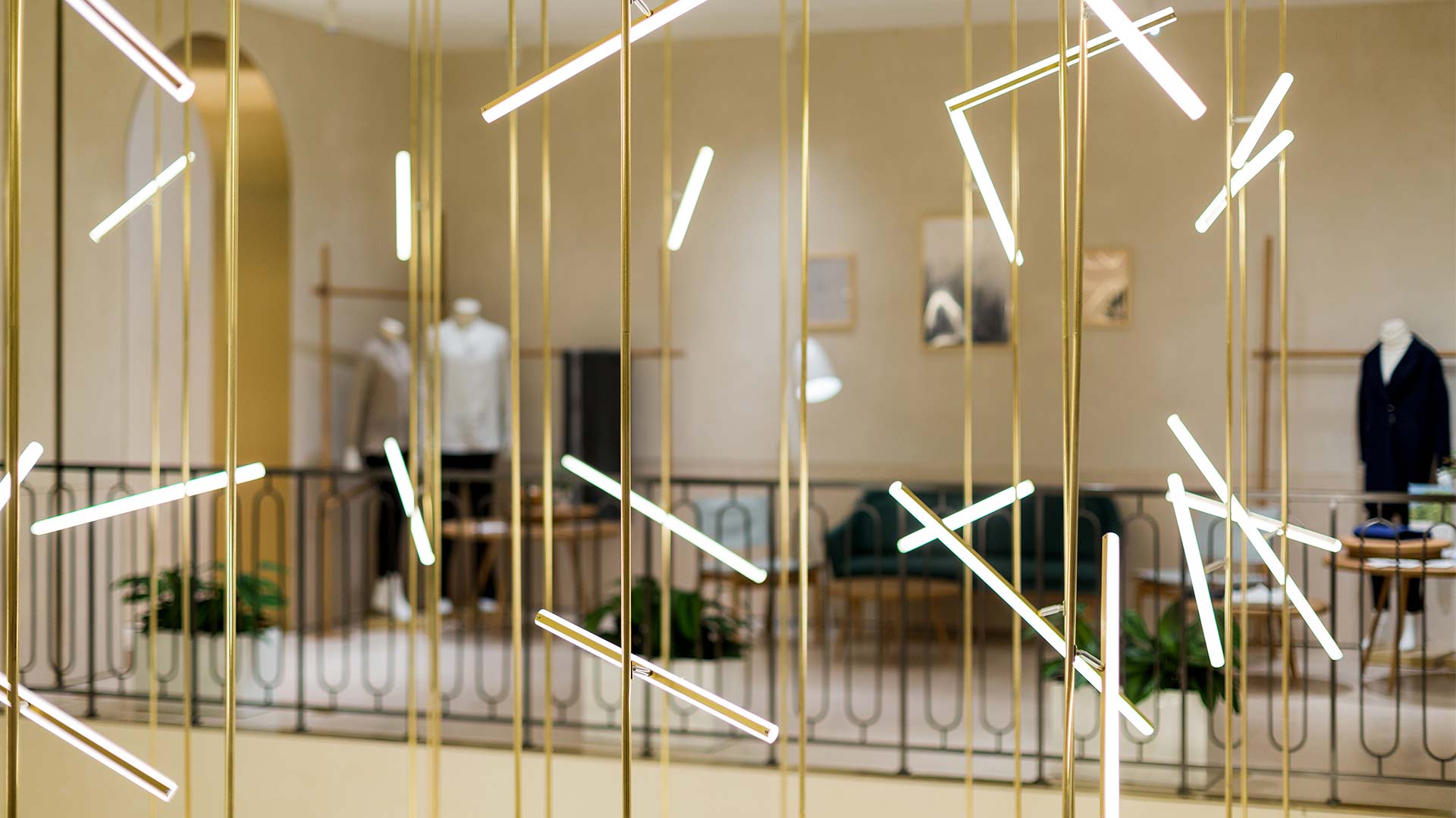
3) Youngor, China – this flagship store unites five Youngor brands under one roof and required a feature decorative pendant within the large atrium. The installation’s clustered suspended lines of light fill the store’s triple-height atrium. It’s confident yet neutral and gives the space a sense of “quality”, while providing the right level of functional light, meaning no further lighting intervention was needed.

Banner image and directly above © Campaign


