The Power of Contrast
You might question why someone who spends most days playing with and obsessing over the position of luminaires would want to talk about darkness.
While it may be unusual to think of darkness in relation to lighting design, it is in my opinion, without doubt, much more important than any single luminaire, material or control system that we’ll ever work with.
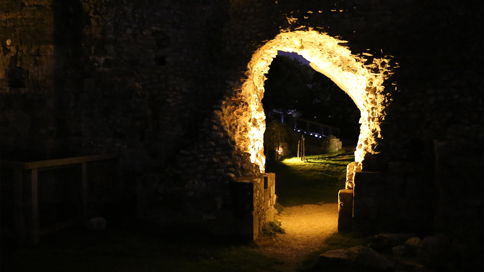
At this point I could labour the obvious and delve into the philosophical – for example, how without dark there can be no light and alike, however, I’m sure you’ve heard it all before. But, as anyone who has ever experienced a room lit by candlelight or walked through the countryside under moonlight can tell you, the impact of light in a dark space can be truly amazing.
If you were to compare lighting to another form of visual design – for this purpose, let’s say graphics – then an un-illuminated space would be represented by a blank page, and light by the stroke of a designer’s pen, pencil or stylus.
As any good graphic designer will point out, negative space left on the canvas is just as important as the areas to which they choose to make their mark. When you view lighting in the same way, it’s clear that the areas you choose not to illuminate in any scheme are equally as important as the ones that you do.
A good example of how darkness can be used to great effect is the Queen Elizabeth Olympic Park. While the park represents fantastic landscape design, for me, it’s only when the sun sets that the use of light and darkness brings the area to life. The design creates an amazingly intimate atmosphere with a considered application of light that totally transforms the space.

(Queen Elizabeth Olympic Park: lighting design by Speirs + Major, scheme delivered by Michael Grubb Studio – photo credit, Michael Grubb Studio)
The lighting scheme doesn’t attempt to illuminate everything; in fact, a large portion of the space remains in relative darkness. Yet, despite this, it feels safe, welcoming and even playful. The focused pools of illumination combined with the suspended luminaires dappled effect plays with light and shadow – the atmosphere created is intriguing, and it encourages people to move through and discover the space.
Unfortunately though, with guidelines and directives pushing for high levels of illumination and uniformity, it’s becoming increasingly difficult for darkness to exist within the built environment.
If you were to take guidelines at face value then the resulting design would be very homogeneous, but also bland, flat, and likely a bit dull. For me this waters down what light can and should be about: light should not just simply be a functional input by which we orientate our environment, light should be an emotional connection through which we experience the world around us.
Finding opportunities to utilise darkness, whether it be through an increased use of contrast or by simply choosing not to light a surface at all (to provide some emphasis), is in itself what lighting design is about.
Darkness is an essential part of lighting and should never be overlooked when considering the illumination of any given space.
To sum things up, just as a firework will lose all impact if used during the day, a lighting design can never truly reach its full potential without a little darkness.
Blog post by Philip Copland
Banner image: Nulty


